Mobile Website Design
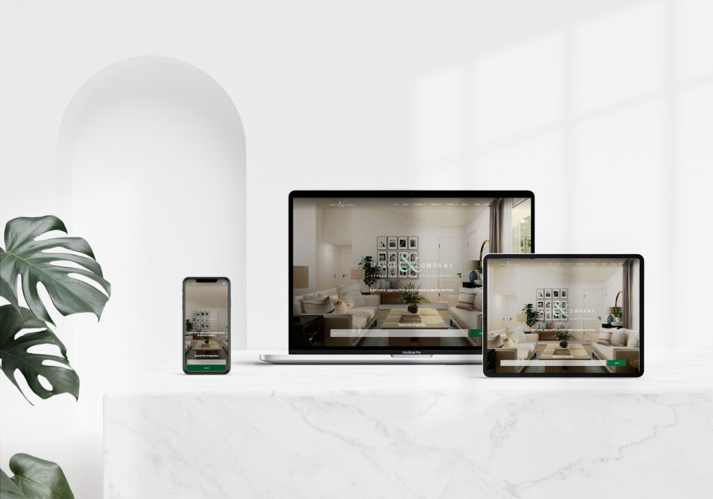
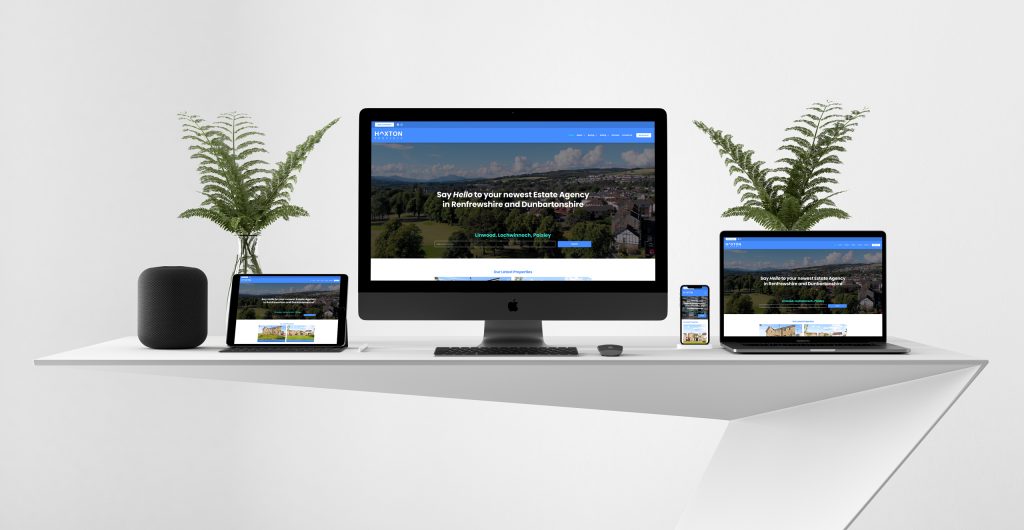
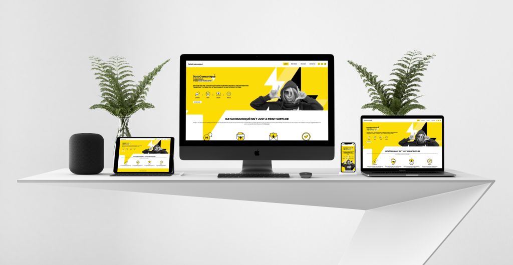
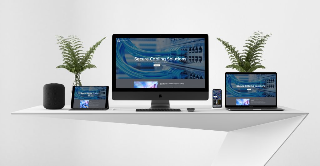
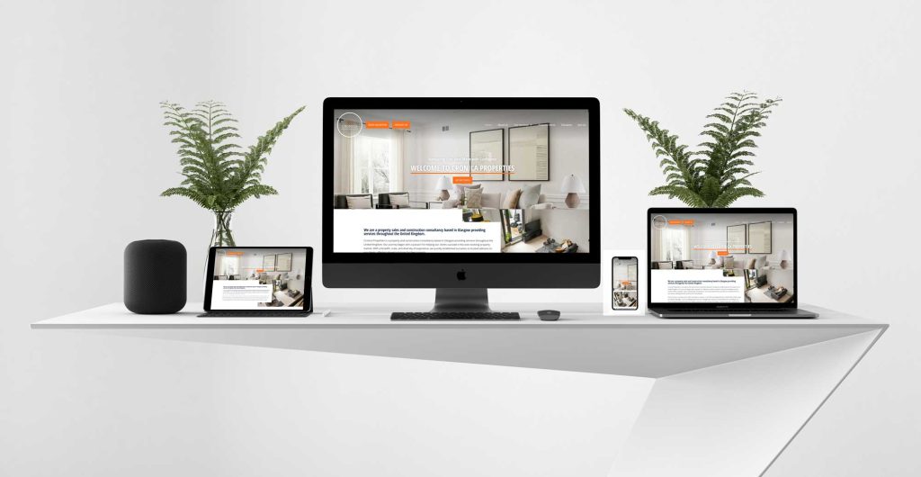
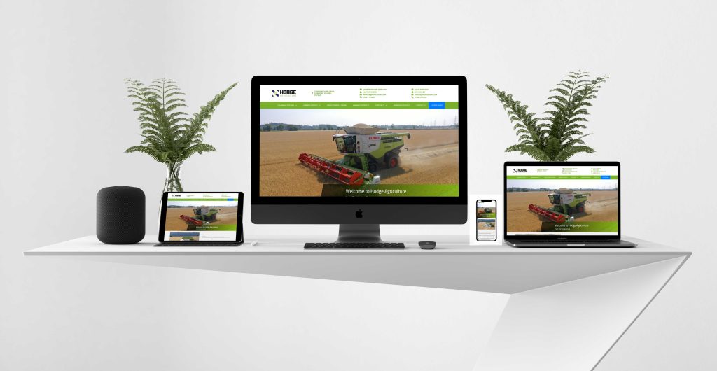
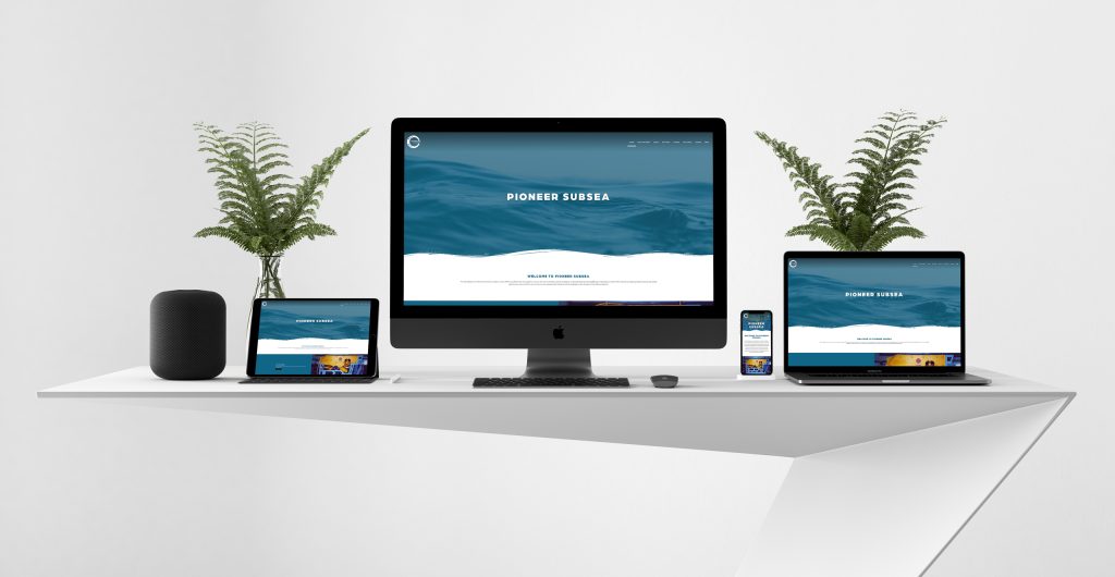
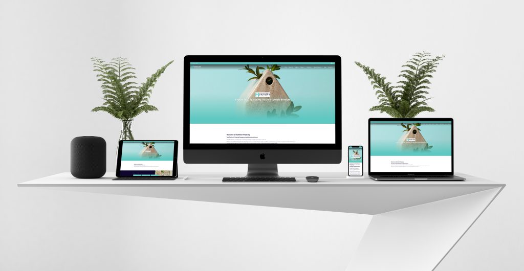
Mobile website design is the process of creating a website that is optimised for viewing and interacting on mobile devices, such as smartphones and tablets. Mobile website design is important because more and more people are accessing the internet from their mobile devices, and they expect a fast, easy and enjoyable experience.
In this post, Rycramweb Ltd will cover some of the basics of mobile website design, such as responsive design, mobile-friendly navigation, content optimisation, and testing. By following these tips, Rycramweb Ltd creates a mobile website that meets the needs and expectations of our clients.
Responsive Design
Responsive design is a technique that allows a website to adapt to different screen sizes and orientations, using flexible layouts, images, and media queries. Responsive design ensures that your website looks good and functions well on any device, without requiring separate versions for each device.
To implement responsive design, you need to use a fluid grid system that divides your website into columns and rows that can adjust to the available space. You also need to use relative units, such as percentages or ems, instead of absolute units, such as pixels or points, to define the size and position of your elements. Finally, you need to use media queries to apply different styles based on the device’s characteristics, such as width, height, resolution, or orientation.
Rycramweb Ltd takes care of this for you.
Mobile-Friendly Navigation
Navigation is the way users move around your website and find what they are looking for. Navigation should be clear, intuitive, and consistent across your website. For mobile website design, navigation should also be simple, concise, and accessible with one hand.
Some of the best practices for mobile website design navigation are:
– Use a hamburger menu or a toggle button to hide and show your main menu items in a collapsible panel. This way, you can save space and avoid cluttering your screen with too many options.
– Use icons or labels to indicate the functionality of your menu items. Icons can help users recognize common actions, such as search, home, or settings. Labels can help users understand what each menu item does, especially if they are not familiar with the icons.
– Use breadcrumbs or indicators to show users where they are on your website and how they can go back to the previous pages. Breadcrumbs are links that show the hierarchy of your website’s pages. Indicators are visual cues that show the current page or section within a menu or a carousel.
– Use a sticky header or footer to keep your navigation visible and accessible at all times. A sticky header or footer is a navigation bar that stays fixed at the top or bottom of the screen as the user scrolls. This way, users can easily access your menu items without having to scroll back to the top or bottom of the page.
Content Optimisation
Content optimisation is the process of making your content easy to read, understand, and consume on mobile devices. Content optimisation involves choosing the right font size and style, using headings and subheadings, breaking up long paragraphs and sentences, using bullet points and lists, adding images and videos, and using white space.
Some of the best practices for content optimisation are:
– Use a font size that is large enough for users to read comfortably without zooming in or out. A general rule of thumb is to use a font size of at least 16 pixels for body text and 24 pixels for headings.
– Use a font style that is clear and legible on small screens. Avoid using fancy or decorative fonts that may be hard to read or distract from your message. Use a font color that contrasts well with your background color.
– Use headings and subheadings to organize your content into sections and topics. Headings and subheadings help users scan your content and find what they are looking for quickly. They also help search engines understand the structure and relevance of your content.
– Break up long paragraphs and sentences into shorter ones. Long paragraphs and sentences can make your content look dense and intimidating on mobile devices. Shorter paragraphs and sentences can make your content look more inviting and easier to digest.
– Use bullet points and lists to highlight key points or steps in your content. Bullet points and lists help users focus on the most important information in your content. They also help users follow instructions or complete tasks more easily.
– Add images and videos to enhance your content and make it more engaging. Images and videos can help users visualize your message and connect with your brand. They can also break up large blocks of text and add some variety to your content.
– Use white space to create breathing room for your content and improve its readability. White space is the empty space between your elements, such as text, images, buttons, etc. White space can help users focus on your content without feeling overwhelmed or distracted by other elements.
Testing
Testing is the process of checking how your website looks and works on different devices, browsers, operating systems, screen sizes, orientations, etc. Testing helps you identify any issues or errors that may affect your website’s performance, functionality, usability, or accessibility. Testing also helps you ensure that your website meets the standards and expectations of our users and clients.
Some of the best practices we use for testing are:
– We use a device emulator or simulator to test your website on various devices and screen sizes. A device emulator or simulator is a software tool that mimics the behavior and appearance of a real device on your computer. You can use a device emulator or simulator to test how your website adapts to different screen sizes and orientations, as well as how it responds to touch gestures, keyboard inputs, etc.
– We also use a browser compatibility tool to test your website on various browsers and operating systems. A browser compatibility tool is a software tool that checks how your website renders and functions on different browsers and operating systems. You can use a browser compatibility tool to test how your website handles different features, such as CSS properties, JavaScript functions, HTML elements, etc.
– We uses a testing tool to test your website with real users. A user testing tool is a software tool that allows you to collect feedback from real users who interact with your website. Rycramweb Ltd uses a testing tool to test how users navigate your website, how they complete tasks or goals, how they feel about your website’s design and content, etc.
Conclusion
Mobile website design is a vital skill for any web designer or developer who wants to create websites that are accessible, usable, and enjoyable for mobile users. Rycramweb Ltd follows these tips that we discussed in this post, Rycramweb Ltd creates a mobile website that meets the needs and expectations of our clients.
We hope you found this post helpful and informative. If you have any questions or comments, please feel free to contact us here. Thank you for reading!